Frenkel 36
A neighborhood bistro bar in Tel Aviv. A tablecloth turned into an identity.
- Type
- Self-initiated concept
- Year
- 2025
- Role
- Visual Designer
- Sector
- Hospitality · Food & Beverage
- Disciplines
- Branding, Print
The Brief
A bar-kitchen on Frenkel Street needed an identity as familiar as a set table — local enough for the neighborhood, composed enough to print on everything from a menu to a ceramic tile. The brief: bottle the feeling of sitting down at a place that already knows you.
The Approach
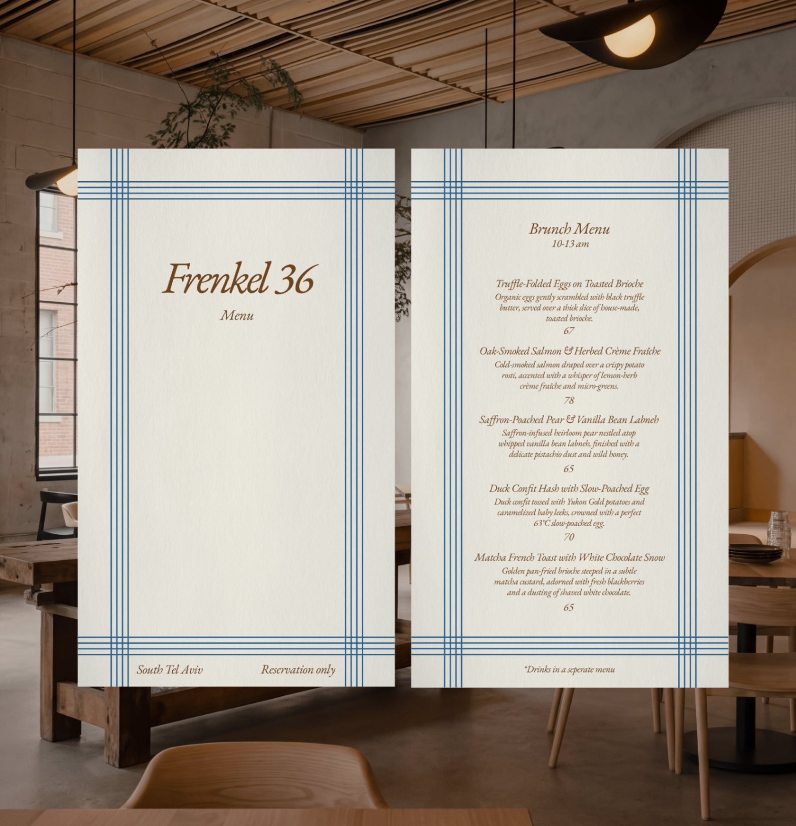
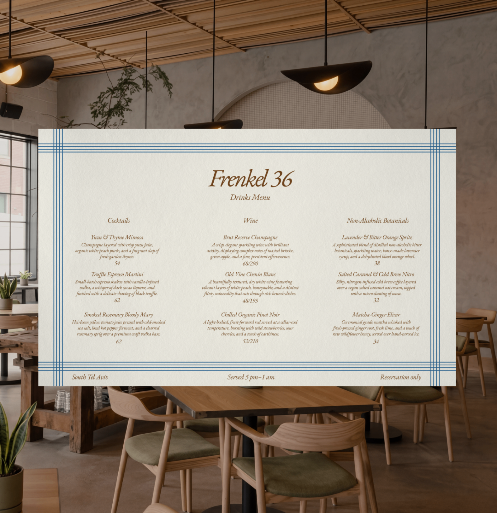
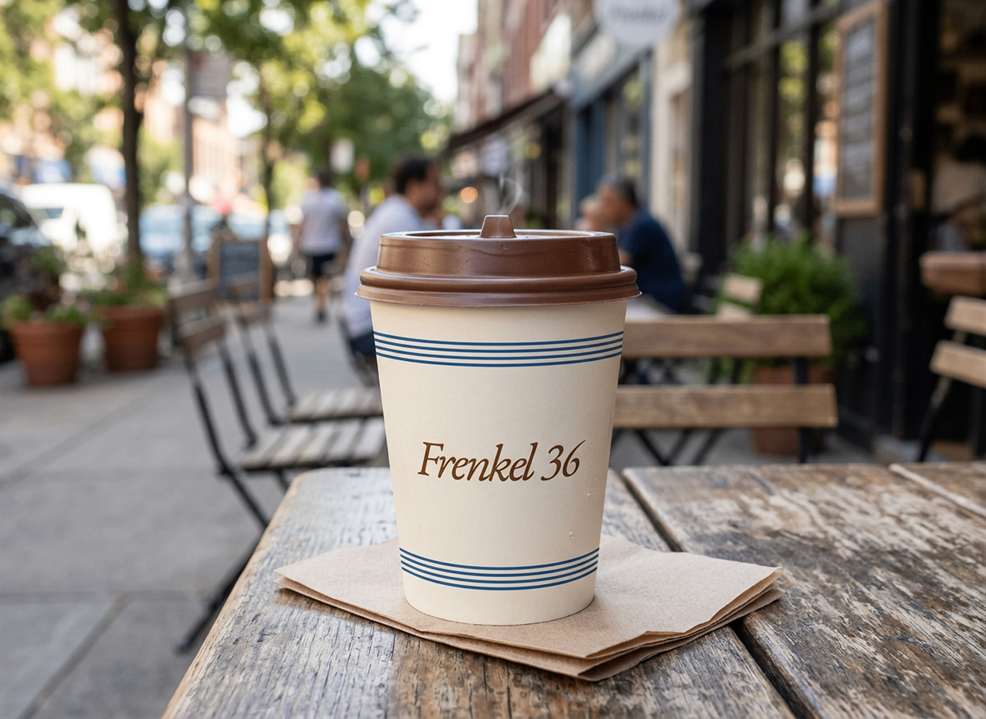
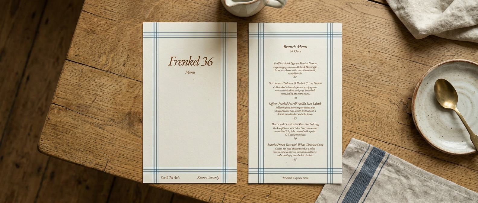
I started from the one object every meal shares: the tablecloth. Its woven blue check became the brand’s grid — framing menus, wrapping takeaway cups, glazed onto tiles, stitched into linen. EB Garamond in warm sienna sets the name like a bistro sign; a cream ground keeps everything sunlit. No logo tricks — just a table, set well.
Constraints
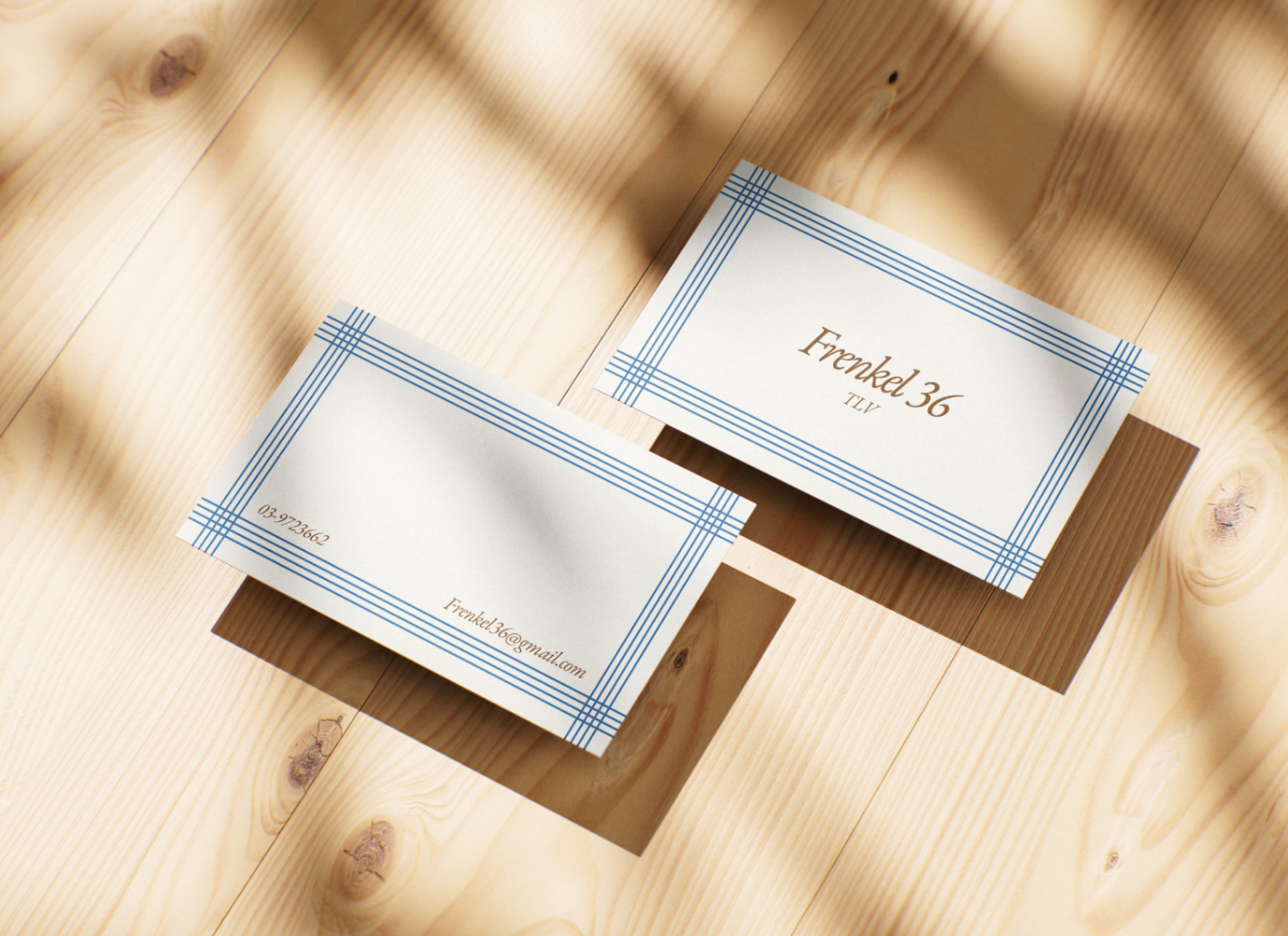
Technical · BusinessPrint-first and material-proof: the identity had to hold from an 85×55mm business card to a full-bleed napkin and a glazed ceramic tile. I built the check as a scalable vector system in CMYK, not a raster texture, so it survives four materials and any print shop.
A neighborhood bistro can’t fund a seasonal rebrand or big signage runs. One motif a local printer can drop onto any surface means the identity scales with the business without new design work each time.
AI in the Process
Tools- Firefly
- Generative mockups — the identity tested on cups, tiles, and the storefront before production.
- Gemini
- Additional mockup and material exploration.
Process — 03
The street, then the table
Walked the identity in from outside: the street’s rhythm, classic bistro linens, the objects guests actually touch. The reference audit kept pointing to the same answer — the brand was already lying on the table.
One motif, every surface
It scales from a hairline frame on a business card to a full bleed on a napkin, holding through every material change — paper, linen, ceramic, cardboard.
Print-first, AI-accelerated
Print-ready menus, cards, and flyers with balanced Garamond settings — the identity proofed on mockups before anything went to production.
Design Decisions
Cognitive rationaleBorrow the tablecloth check
Familiar things feel likable and safe. Guests already associate the blue check with a table set for them, so the brand reads as known and welcoming on first sight — no learning curve.
One pattern unifies every surface
The repeating check ties a cup, a menu, and a tile into one system through visual similarity — the eye groups them as belonging together, which lets the brand cohere without leaning on a literal logo.
Sienna on cream, one serif
Warm, gentle contrast and a single readable serif make the type effortless to process. Fluent reading feels comfortable and trustworthy — the perceptual equivalent of the bistro’s own ease.
The System — 01
Identity anatomyTHE SYSTEM · ONE MOTIF, FOUR MATERIALS
The check is a system, not a decoration — the same motif survives paper, print, cardboard, and glazed ceramic without being redrawn.
Palette — 03
Every color means something- Cream #F7F3E8
- The sunlit ground. The tablecloth before service.
- Woven Blue #4A6491
- The check itself — the grid every surface inherits.
- Warm Sienna #8C4A2F
- The name over the door. Bistro signage, not branding.
Typography — 01
The voiceEB Garamond
Display & name
Set like a bistro sign: warm, readable, unhurried.
Motif
The woven check is the whole system: one motif, drawn once, carried across four materials.
User Research
Methods · Participants · InsightsKey Insights
- 01
The neighborhood already had the brand: a set table. The identity’s job wasn’t to invent — it was to bottle it.
- 02
A motif earns its place by surviving scale. If the check works as a hairline on a card and a full bleed on a wall, it works everywhere.
- 03
Mockups sell branding. Seeing the cup on the sidewalk and the tile on the wall decides faster than any moodboard.
Outcome
A tablecloth became a brand. From the brunch menu to the takeaway cup on the sidewalk, every touchpoint sets the same table — cream, blue check, and a name in sienna.
Reflection
Next step: pressure-test the motif in the real space — printed, glazed, and lit — where materials, not screens, decide.
Final Products — 04
Gallery