Rega
A therapeutic art-making retreat in the Galilee. An identity built around taking a moment.
View live site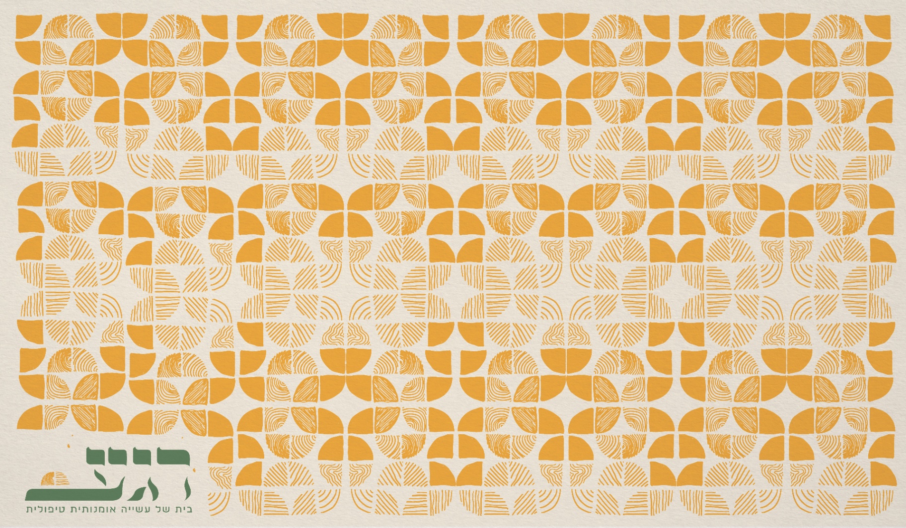
- Type
- Self-initiated concept
- Year
- 2024 — 2025
- Role
- Brand & Web Designer
- Sector
- Hospitality · Wellness & Arts
- Disciplines
- Branding, Web Design
The Brief
Rega — Hebrew for “a moment” — is a therapeutic art-making retreat in the Galilee: studio workshops, olive-grove rooms, stays from a weekend to a full week. It needed a brand and a booking site that feel like the place itself — unhurried, handmade, warm — and a way for guests to book that calm without breaking it.
The Approach
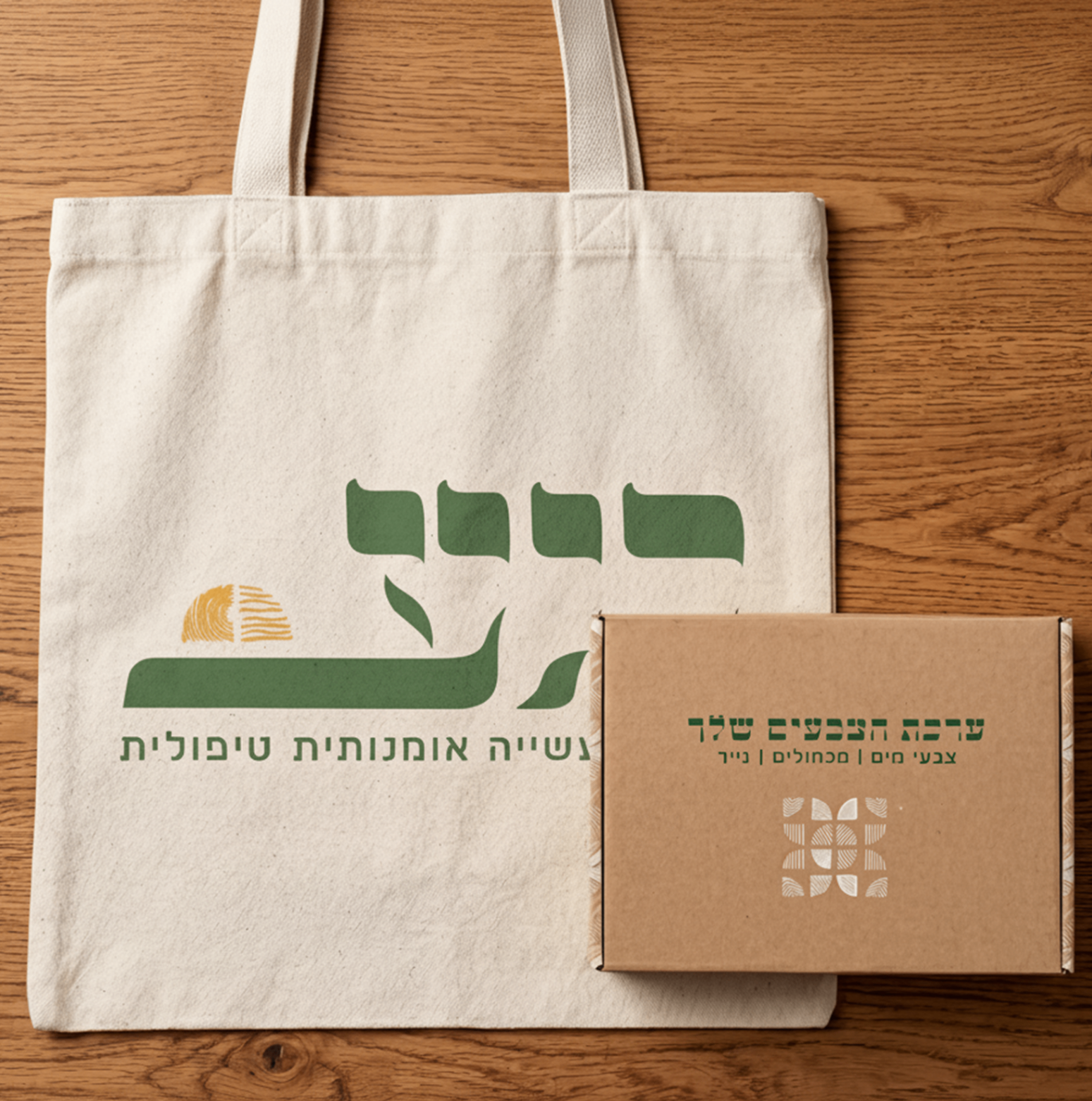
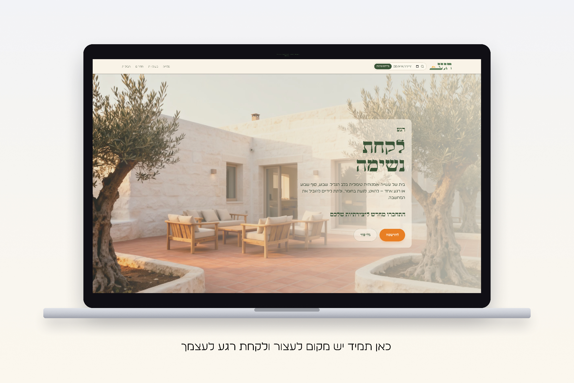
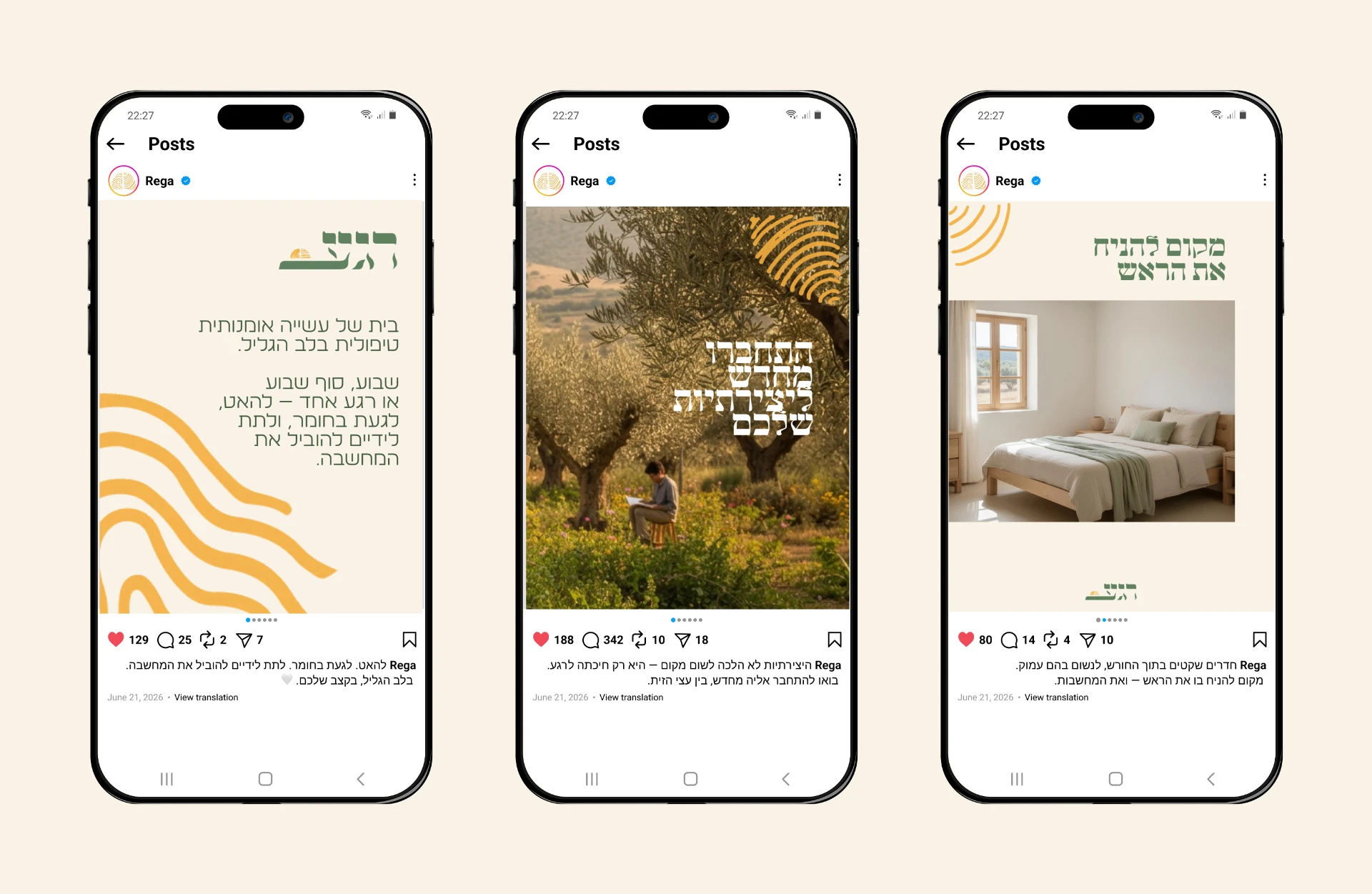
The identity starts at the logo: hand-drawn Hebrew letters resting on a horizon line, a fingerprint sun rising behind them — personal as a signature, warm as Galilee light. Cream, olive green, and sun orange carry the system across a fully right-to-left website — home, rooms, and a three-step booking flow — shipped as a live, working site.
Constraints
Technical · BusinessShipped as a live, fully right-to-left Hebrew site built in Lovable, with the booking flow constrained to exactly three steps so it could be launched and maintained without a dev team.
Boutique-retreat bookings happen thumb-first on phones, and every extra field is a drop-off. The funnel had to stay ruthlessly short, because a wellness booking that feels like paperwork loses the guest.
AI in the Process
Tools- Lovable
- The live site itself — built, iterated, and shipped in Hebrew, right to left.
- Kling
- The brand films — the commercial and walkthrough motion.
- Firefly
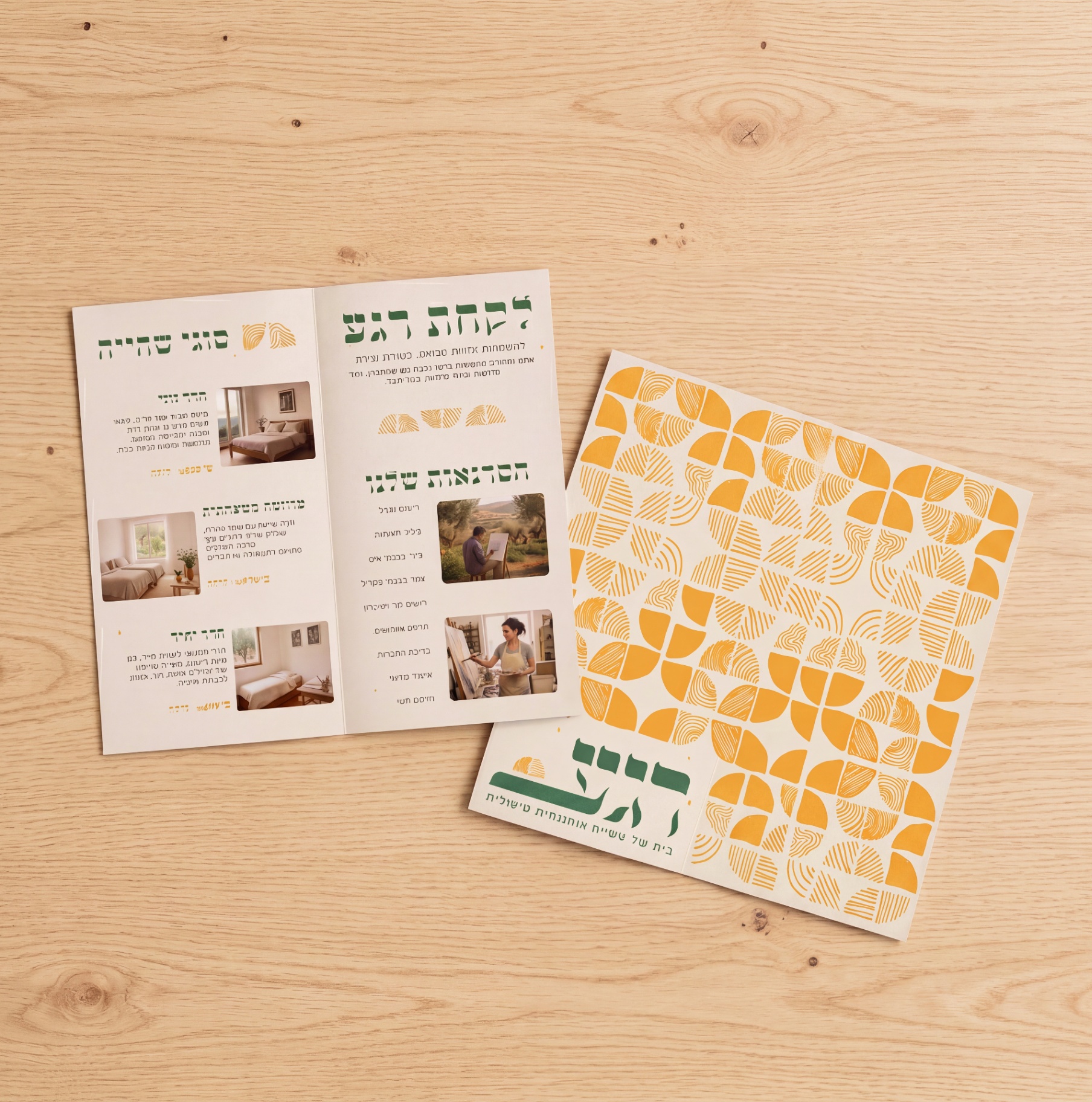
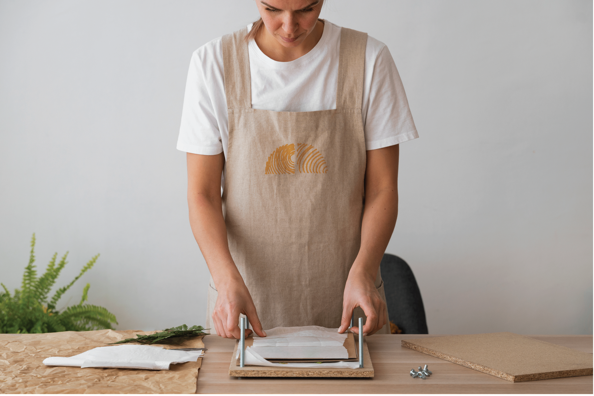
- Generative imagery and product mockups — brochure, tote, apron.
Process — 03
A moment, defined
The name set the bar: every choice had to slow the visitor down. Mapped the guest’s path from first glance to booked stay — packages, rooms, workshops — before drawing a single pixel.
Calm that still converts
The site sells quiet but works hard: three stay packages, three room types, nine studio workshops, and a stepped booking flow — package, details, confirmation — that keeps every choice light.
A fingerprint for a sun
The hand-lettered mark, a cream-olive-orange system, serif Hebrew display over a quiet sans, fully right-to-left layout — shipped live, with marketing films and a logo animation.
Design Decisions
Cognitive rationaleAir as an interface choice
The generous white space isn’t decoration — reducing visual density lowers cognitive load, so the site feels calm and therapeutic before a single word is read. The layout does the emotional work.
A three-step booking flow
Package, details, confirmation. Chunking the decision means working memory only ever holds one choice at a time, so booking a stay never feels heavier than the stay itself.
A hand-drawn, fingerprint mark
The handmade logo and fingerprint sun create a warm first impression that colors the whole visit. A single signal of care and craft at the top makes everything below it feel more personal and trustworthy.
The System — 01
Identity anatomyTHE SYSTEM · A MARK YOU COULD DRAW BY HAND
Palette — 03
Every color means something- Cream #F9F3E6
- The light. The paper the retreat is drawn on.
- Olive #608260
- The grove. The green the rooms wake up to.
- Orange #F3AE3D
- The moment. The fingerprint sun over the horizon.
Typography — 02
The voiceMugrabi
Display & logotype
A stencil face — letters with the cut-and-placed roughness of handmade.
Birzia
Text
A quiet Hebrew text face that lets the mark lead.
Motif
A fingerprint for a sun — handmade, personal, one of a kind — rising over every touchpoint.
User Research
Methods · Participants · InsightsKey Insights
- 01
Calm is a layout decision. Air between elements does more for “therapeutic” than any word on the page.
- 02
The booking flow is part of the brand. If choosing a package feels like paperwork, the spell breaks.
- 03
A mark can carry the promise: guests read the hand-drawn logo as a signal of what the stay itself will feel like.
Outcome
A moment became a brand — and a working site: identity, rooms, and workshops live in Hebrew, with a booking flow that stays as calm as the stay it sells.
Reflection
It’s already live in Hebrew; next I’d watch real users move through the web flow and cut anything that adds a beat.
Final Products — 07
Gallery