Omer-Aviv
A security & communications integrator, working since 1971. A redesigned identity and a bilingual site built to feel as precise as the engineering.
View live site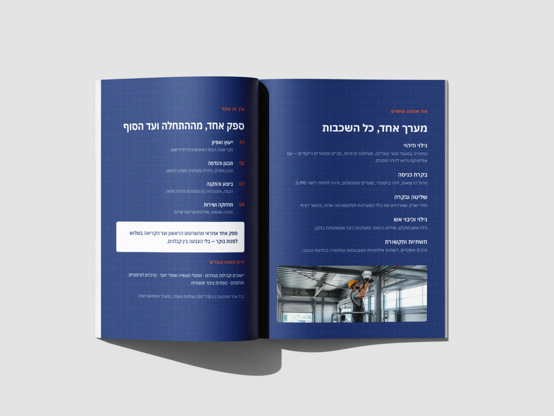
- Type
- Client project
- Year
- 2026
- Role
- Brand & Web Designer
- Sector
- Security & Communications · Systems Integration
- Disciplines
- Branding, Web Design, Print
The Brief
A security & communications integrator since 1971 — ISO 9001 certified, with clients from Haifa Port to Coca-Cola. But a dated, crowded website and an inconsistent identity undersold all of it. The brief: make the brand look as precise and dependable as the systems it delivers, in Hebrew and English.
The Approach
I kept the equity — the interlocking "oa" monogram and the navy-and-orange palette — and rebuilt everything around it. The organizing idea came from the work itself: engineering graph paper. A fine blueprint grid became the connective tissue under every surface, signalling precision before a word is read; navy carries authority, orange marks the one action.
Constraints
Technical · BusinessA rebuild, not a blank page: the "oa" monogram and the navy-orange palette had real equity and had to stay recognizable. I redrew the logo and built an entire system around those fixed points rather than replacing them — evolution the company's long-time clients would still recognize.
The site had to ship fully bilingual — right-to-left Hebrew with a mirrored English version — and stay maintainable by a small team. So I designed on a strict grid with a reusable component structure instead of bespoke one-off layouts.
Tools & Systems
Used in the making- Figma
- The design environment — the full brand system and every website screen designed and iterated here.
- Claude Code
- The AI build partner — turning the finished designs into working screens at efficient volume, fast.
- Lovable
- Execution — the live bilingual site, shipped in Hebrew (right-to-left) and English.
Process — 03
Read the work, not just the brand
Audited the old site and the competitors, and mapped what Omer-Aviv actually sells: complex, high-trust engineering projects. That set the direction — the brand had to signal precision and reliability, because in security, trust is the product.
Graph paper as the grid
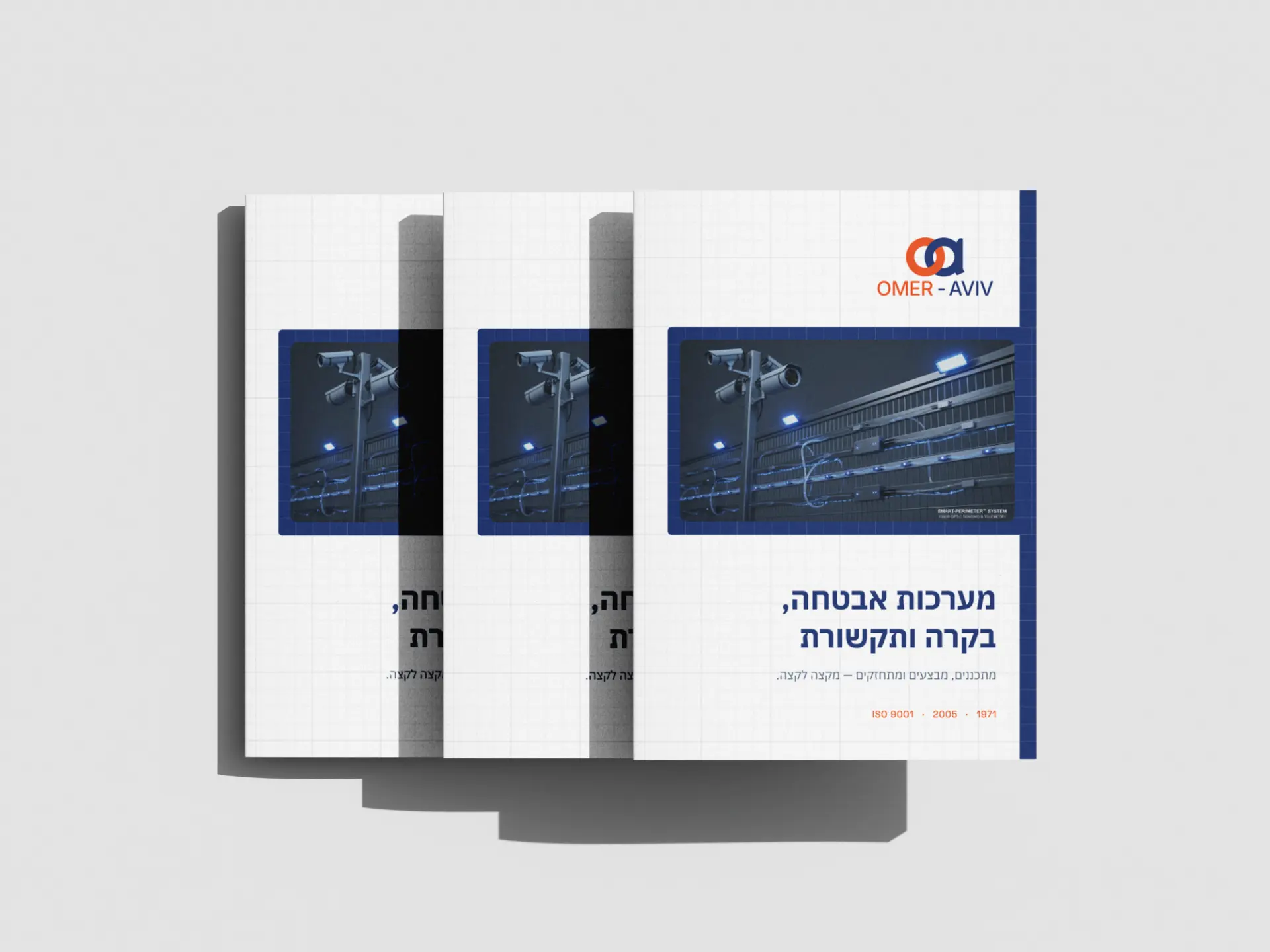
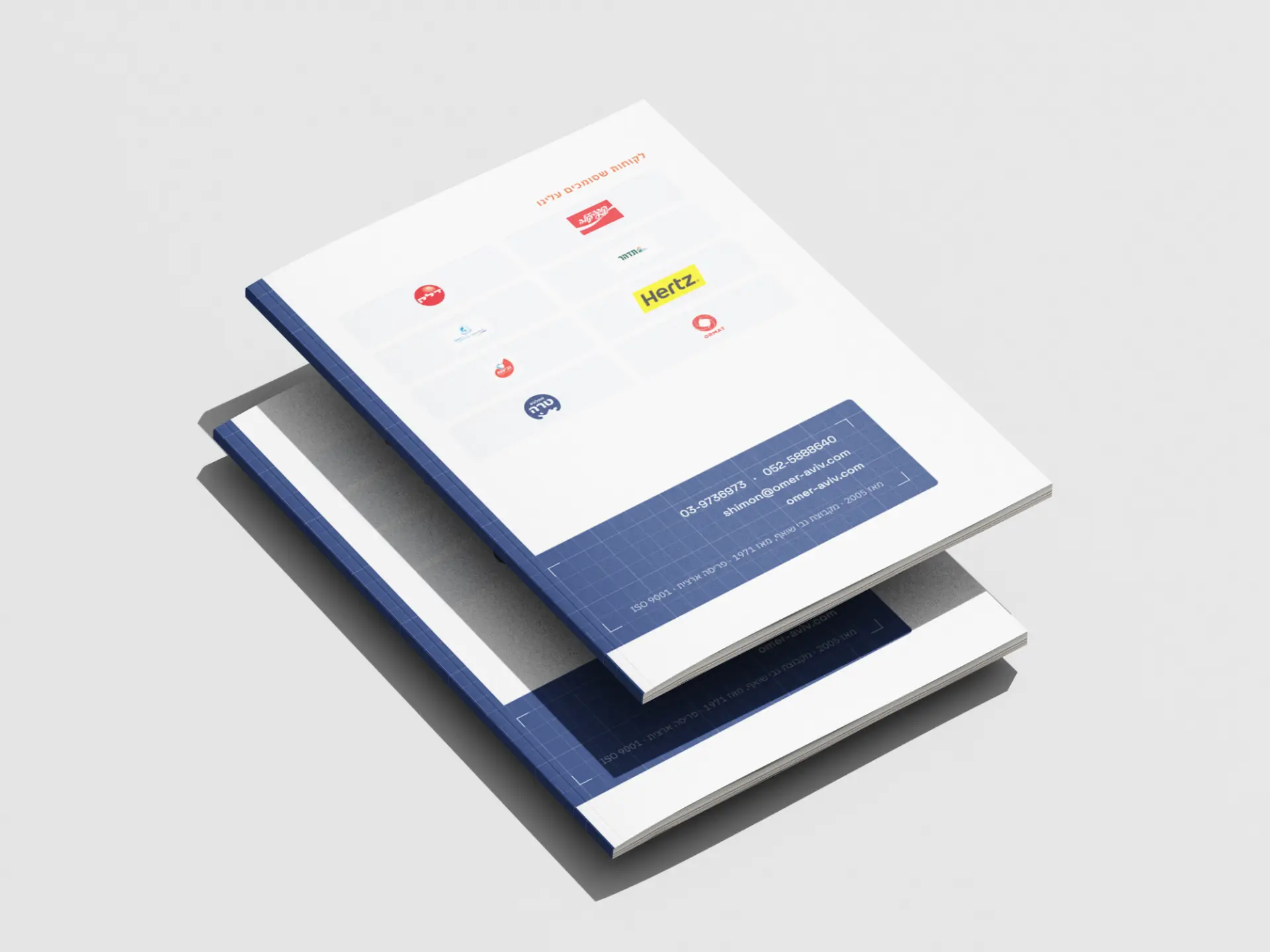
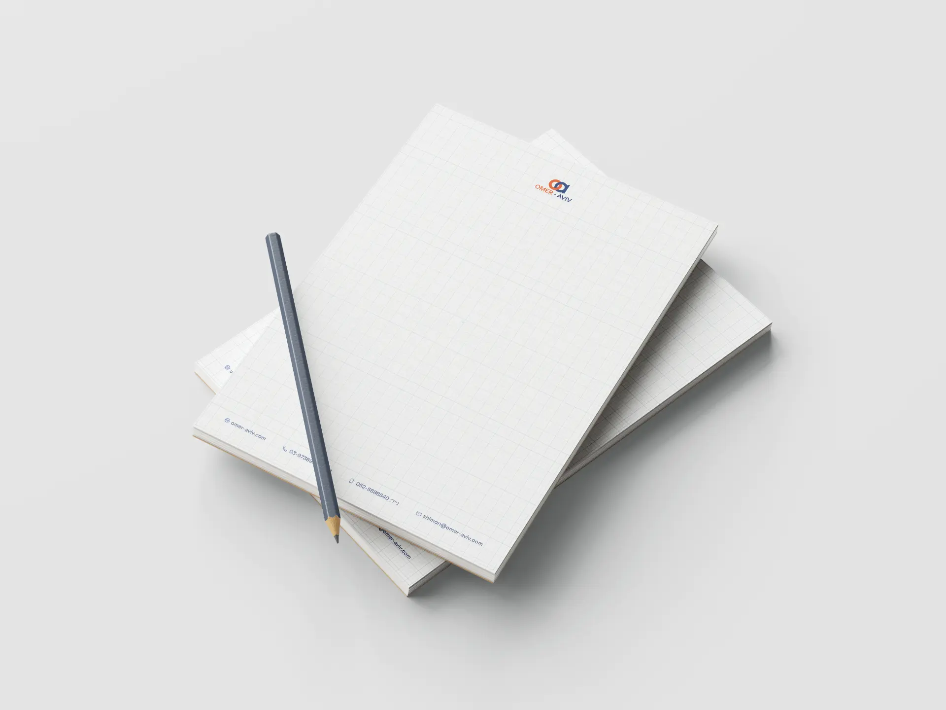
Turned engineering blueprint paper into the brand's core motif: a fine grid under every surface that ties print to screen. Redrew the "oa" monogram for legibility at small sizes, locked navy as the authority colour and orange as the single accent, and built the stationery suite — cards, letterhead, brochure — on that one grid.
From brochure to a clear path
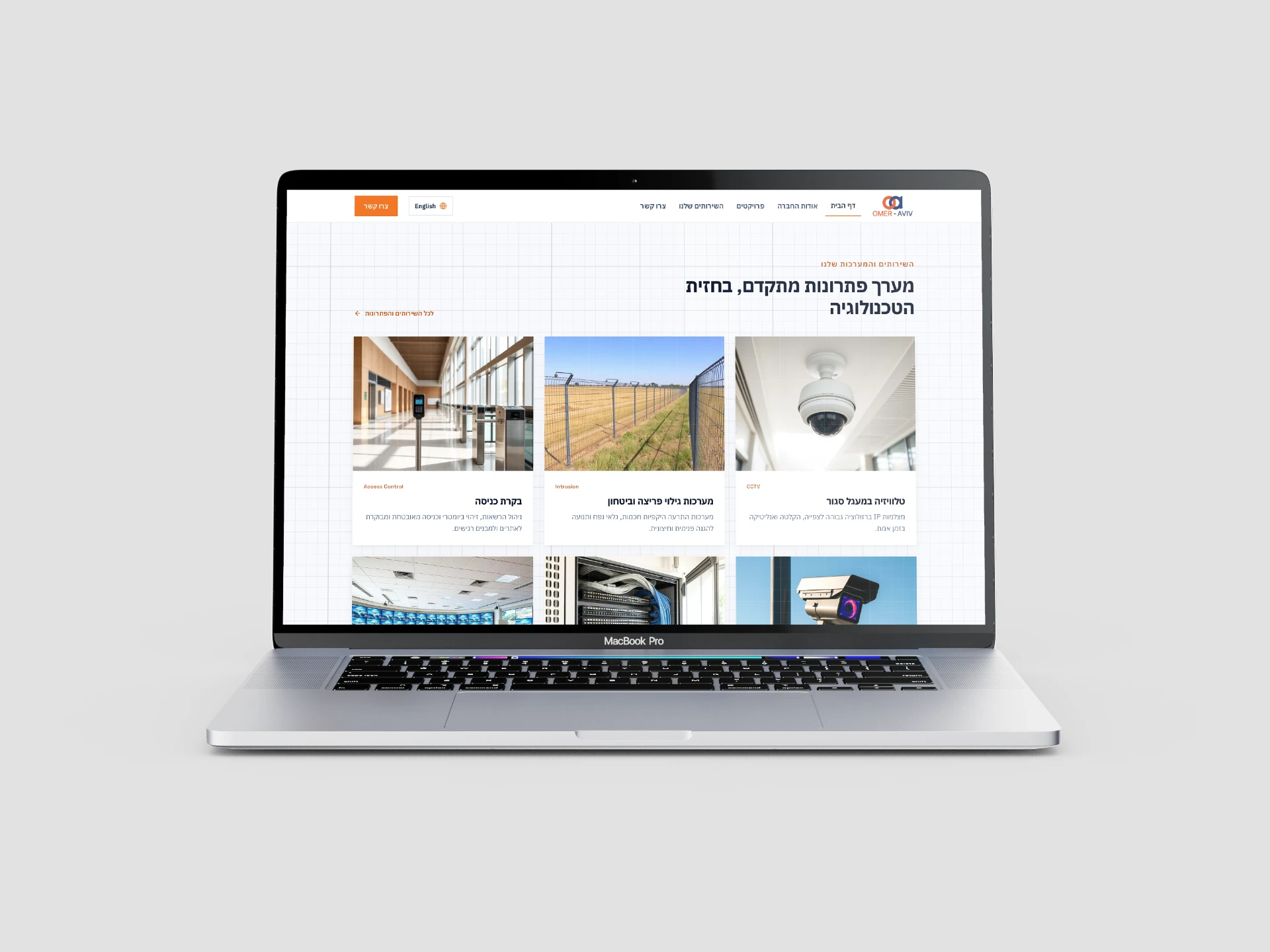
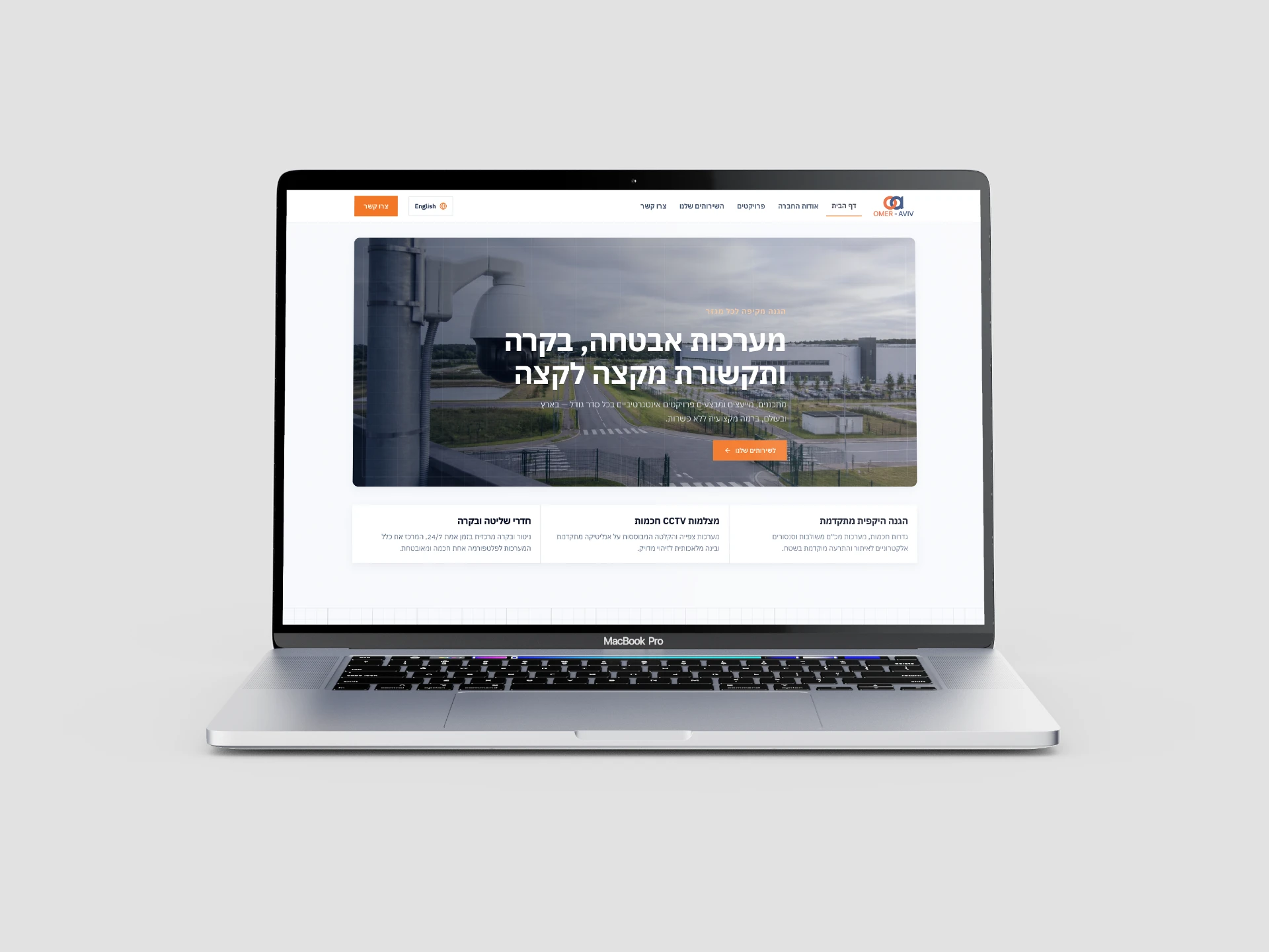
Rebuilt the site around what a buyer needs: a sector-first hero, a scannable grid of nine services, a proof wall of clients, and one repeated call to action. Structured fully bilingual, right-to-left Hebrew and English, so the same clarity holds in both directions.
Design Decisions
Cognitive rationaleA grid that signals precision
The blueprint grid isn't decoration. Orderly, fluent visuals are unconsciously read as competent and trustworthy — and for a security integrator, looking precise is itself a trust signal, so the grid persuades before a single claim is read.
Orange spent once
Navy carries almost everything; orange is reserved for the one thing that matters on each surface — the next action. Because the accent is scarce, the eye lands on the CTA every time, so even a dense B2B site keeps one obvious way forward.
A wall of names, placed early
Haifa Port, Coca-Cola, Hertz, Ormat — the client logos sit high on the page with room to breathe, because in high-risk purchases buyers borrow trust from whoever already trusted you. The proof comes before the ask, not after.
The System — 01
Identity anatomyTHE SYSTEM · ONE GRID, EVERY SURFACE
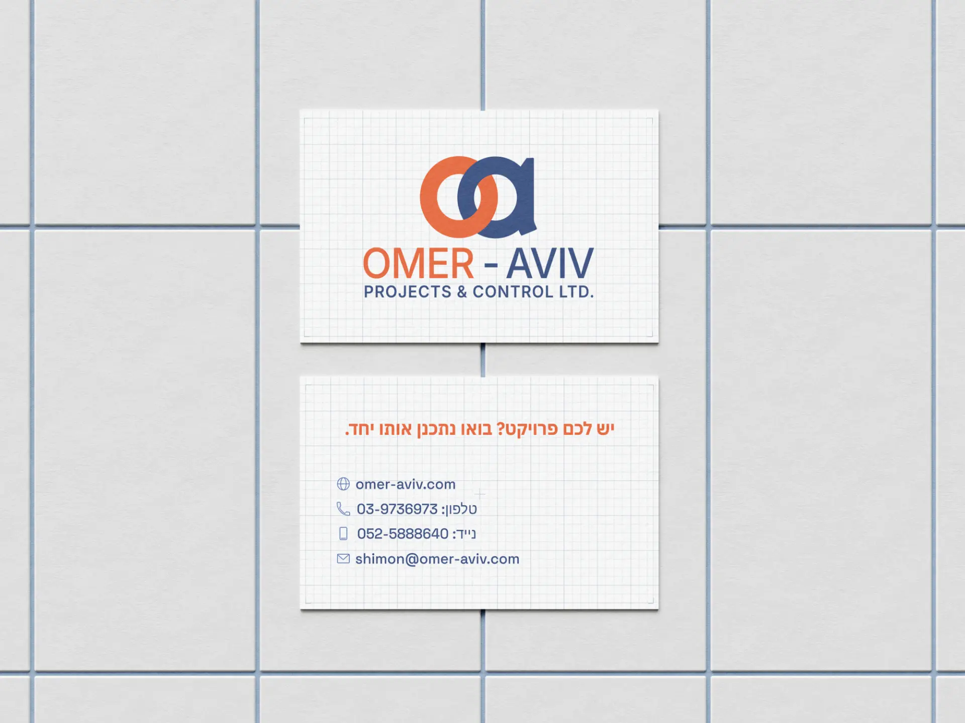
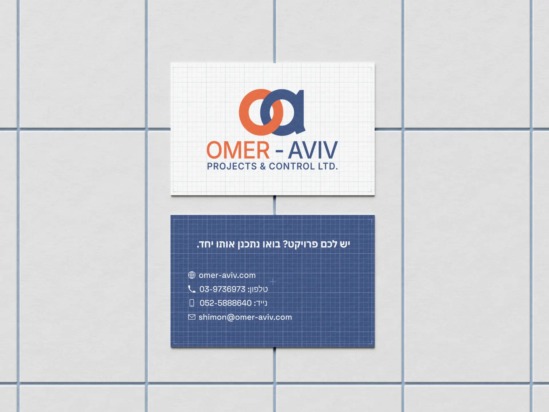
The blueprint grid is the system, not a background — the same engineering paper runs under the logo, the business card, the brochure, and the website hero, tying print and screen into one language.
Palette — 03
Every color means something- Navy #101F39
- Authority. The blueprint ground everything is drawn on.
- Signal Orange #F27626
- The one action. Spent once per surface, so the eye always finds the way forward.
- Grid Line #DCE2E9
- The engineering grid — graph paper, ruled faintly under every surface.
Typography — 01
The voiceIBM Plex Sans Hebrew
Interface & wordmark
A technical, engineered sans — precise in Hebrew and English, so the type reads as exact as the systems it names.
Motif
Engineering graph paper — the grid is the connective tissue, ruled under the logo, the business card, the brochure, and the website hero, tying print and screen into one language.
User Research
Methods · Participants · InsightsKey Insights
- 01
In security, trust is the product. A buyer picks the integrator that looks most precise and dependable — the brand has to earn that before the spec is even read.
- 02
The old site buried the range. Omer-Aviv does far more than cameras; the redesign had to make the full end-to-end capability scannable at a glance.
- 03
Proof beats claims. A blue-chip client list persuades faster than any adjective, so it earns a place high on the page.
Outcome
A dated integrator now reads like a modern engineering firm. One grid system carries a redesigned logo, a full stationery suite, and a bilingual (RTL Hebrew / English) website — from the first sketch on graph paper to a live site that ends every path at "let's examine your spec together."
Reflection
Next step: watch how the sales team uses the site in real pitches — which sections they lean on, where a prospect drops — and tune the service pages and CTA around what actually wins the project.
Final Products — 08
Gallery